
Card
A surface that groups content about one subject: optional media with a badge, then a slot for content (by default, Card Content).
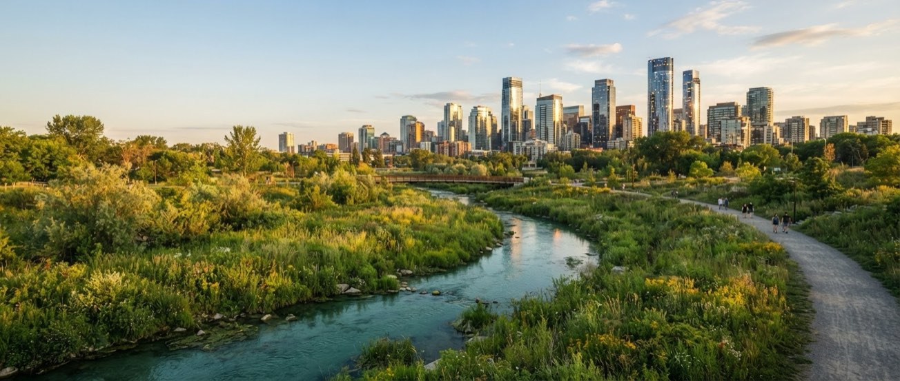 Field notes
Restoring the city’s hidden waterways
A community-led project is bringing native habitat and public paths back to a long-buried urban stream.
Usage
Import the component and render it.
import { Card } from 'src/components/Card/Card';
import { CardContent } from 'src/components/Card/CardContent';
import { NotificationIcon, BookmarkIcon, ShareIcon, DotsThreeVerticalIcon } from '@phosphor-icons/react';

<Card
  layout="vertical"
  density="default"
  surface="outlined"
  media="/docs/card-media.jpg"
  badge="Field notes"
  badgeIcon={<NotificationIcon />}
>
  <CardContent
    title="Restoring the city’s hidden waterways"
    description="A community-led project is bringing native habitat and public paths back to a long-buried urban stream."
    author="Maya Chen"
    details="Environment · 8 min read"
    primaryAction="Read story"
    actions={[{"label":"Save","icon":<BookmarkIcon />},{"label":"Share","icon":<ShareIcon />},{"label":"More options","icon":<DotsThreeVerticalIcon />}]}
  />
</Card>
Accessibility
Role: none of its own: a container; its content brings the semantics (e.g. the Card Content heading).
| Key | Action |
|---|---|
| Tab | Moves through the interactive content of the slot |
- The media image is decorative by default (alt=""); set mediaAlt when it adds information.
- The Badge is plain text over the image; the scrim keeps it readable.
- Put Cards that belong together in a list (ul/li) so assistive technology announces how many there are.
Layout
Set the layout prop: Vertical is "vertical", Horizontal is "horizontal".
Field notesRestoring the city’s hidden waterways
A community-led project is bringing native habitat and public paths back to a long-buried urban stream.
Field notesRestoring the city’s hidden waterways
A community-led project is bringing native habitat and public paths back to a long-buried urban stream.
<Card layout="vertical" />
<Card layout="horizontal" />
Density
Set the density prop: Default is "default", Compact is "compact".
Field notesRestoring the city’s hidden waterways
A community-led project is bringing native habitat and public paths back to a long-buried urban stream.
Field notesRestoring the city’s hidden waterways
A community-led project is bringing native habitat and public paths back to a long-buried urban stream.
<Card density="default" />
<Card density="compact" />
Surface
Set the surface prop: Outlined is "outlined", Raised is "raised".
Field notesRestoring the city’s hidden waterways
A community-led project is bringing native habitat and public paths back to a long-buried urban stream.
Field notesRestoring the city’s hidden waterways
A community-led project is bringing native habitat and public paths back to a long-buried urban stream.
<Card surface="outlined" />
<Card surface="raised" />
Composition
Use the following composition to build a Card:
Card
├── CardContent
│   ├── Avatar
│   ├── Separator
│   └── Button
└── Badge
CardContent
The content the Card slot prefers: title and description, author metadata, a divider, a primary action and utility actions. Only used inside Card.
Restoring the city’s hidden waterways
A community-led project is bringing native habitat and public paths back to a long-buried urban stream.
<CardContent title="Restoring the city’s hidden waterways" />